

The Seattle Thunderbirds are a major junior hockey team in the Western Hockey League.
I don't like hockey jerseys with words on the front. To me, they feel "minor league" in a bad way. In addition, the team hasn't played its home games in Seattle in more than ten years. (They play in Kent, Washington, about 20 miles south of Seattle.)
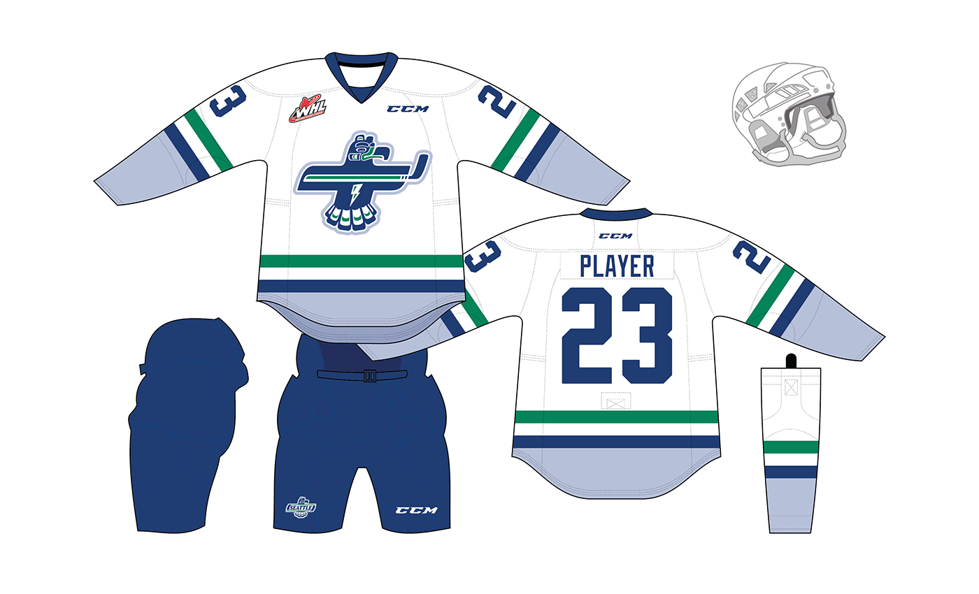
I attempted to retain the equity of the Native American thunderbird carving while simplifying the design and "sweetening" the curves just a bit. The new bird has a slight forward lean to impart speed and aggression. The lightning bolt and hockey stick combine to suggest a T, emphasizing the Thunderbirds part of the name rather than the no-longer-technically-accurate Seattle.

Existing logo (ABOVE LEFT). Alternate logo concept (ABOVE RIGHT and BELOW).


The current Thunderbirds uniforms have a Hartford Whalers-esque pattern, with a mismatched sock stripe. Here I made all the striping identical, for a modern look to complement the streamlined logo. I removed the unnecessary outlines on the numbers for the same reason. (And yes, gear geeks, I realize this is a Reebok template with CCM branding. It was what I had readliy at hand.)
Thanks for viewing!


